ExchangeDefender’s New Support Groove
Psst. It’s time for better support.
ExchangeDefender has been working on a massive infrastructure upgrade and reengineering project since early 2017 and we’re happy to report that we’re providing better service and offerings than at any time in the past. Now we’re thrilled to announce the launch of our newest support portal that will converge email, chat and support ticket activity in a single, process-driven solution.
This means we will be able to help you better, faster, and in realtime. Tomorrow, June 1st, at noon… we will launch our new support UI:
Responsive User Interface
Our entire UI is now built on a responsive user interface that looks great no matter what device (desktop, browser, mobile, tablet) you use it from. No more smudged and unreadable fonts, no more zooming, panning and scrolling. Best of all, much faster and refresh-free UI!Fewer Clicks, Faster Access
Hate having to click 80 times to get to what you need? So do we – and most people access ExchangeDefender on a touch-enabled device these days! We listened and designed a new portal that gets you where you need to go faster.More Intuitive Design & User Experience
You no longer need a masters degree in CRM software to navigate around the platform, anyone can do it. No more scrolling through pages of text and form fields, everything you need it at your fingertips.
Friday, Friday, Friday… at noon!
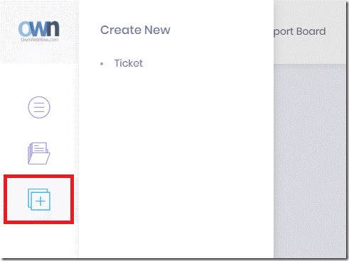
As mentioned above, the new UI is designed to help real people, doing real work, in the real world – not just office power users on arcane hardware (don’t worry, we got shortcuts and powerups for you as well). In order to accomplish that, everything in the new interface is intuitive. Want to create a new ticket? Here is how:
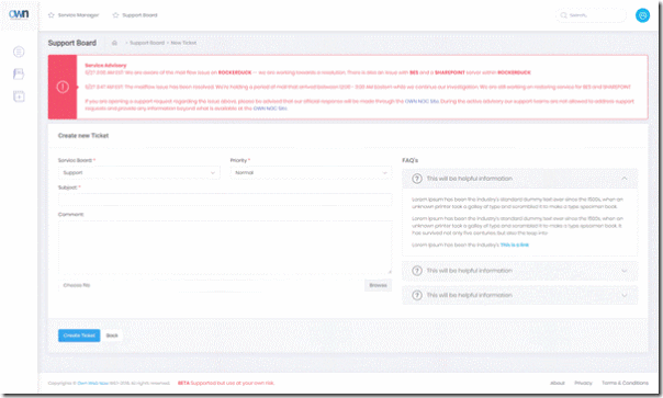
Same behavior you have on the desktop is the same behavior you’ll have on your tablet and phone. Best part is, we are not taking anything away, just adding more useful content that is always at your fingertips. For example, take a look at the new ticket screen:
We have removed the clutter, emphasized the important announcements, improved page loading time, require far less scrolling and the elements you need will automatically load into view as you start a service support request.
You’ve probably seen paper after paper illustrating how much modern consumers rely on self-help and self-service sites rather than picking up the phone, sending an email or opening up a support request. With our integrated FAQ, smart answers and realtime resources (including chat) we will be able to help you with the routine and simple tasks without having to wait. Or scroll.
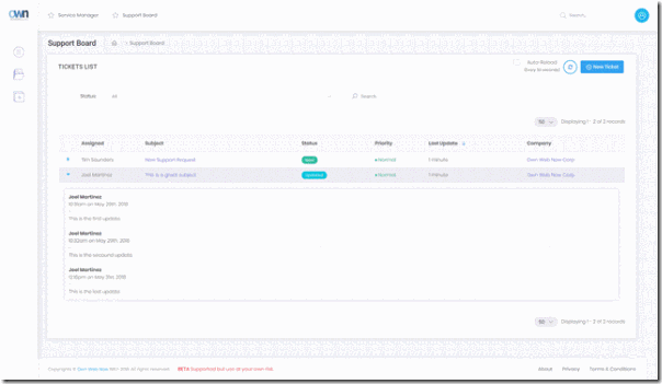
Working on a bunch of issues at once? Our system will now allow you to quickly access all of your tickets and see updates without opening a million tabs or scrolling for days.
We have added a bunch of new conveniences that allow for realtime results, automatic refresh and quick updates.
The big idea with the new portal is that many problems, projects, issues or inquiries can be handled much faster without having to switch from ticket to ticket, system to system, or screen to screen. Most of the service is simply acknowledging that the issue has been received, acknowledged, reviewed and assigned to the right person that can help right now.
If you’re used to the old way of doing things, and don’t look too closely, not much will change. It’s still all there, just much cleaner and simpler:
Working on tickets and on teams is now simpler than ever. We got rid of the old one-owner one-client one-issue model and can now easily add employees on this side that can help. Unlike the old days, the issue and responsibility doesn’t end at the point of assignment – everyone is still accountable to the client and now we can respond faster and work on an issue as a team.
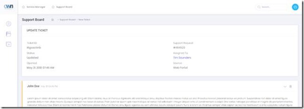
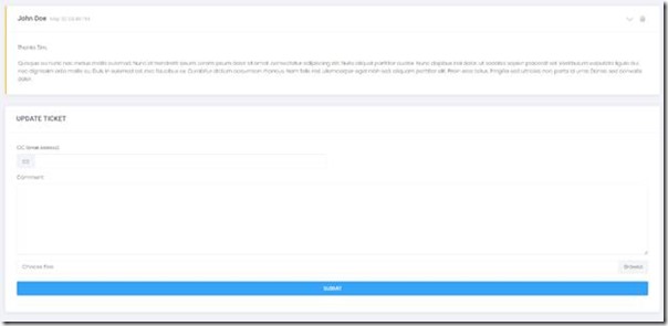
You will notice that our ticket update screen has gotten a lot simpler as well. When you update tickets, you won’t see an entire page refresh either. There is a reason for that: We are moving towards full realtime portal – meaning we can start supporting users in a chat and reduce the amount of time wasted searching, navigating and waiting on the browser or page to load.

